LivingSocial
I joined LivingSocial just before they raised a large round of funding and underwent tremendous growth. At the time they were using a very scrappy startup-like logo, and they wanted to elevate the brand to more accurately reflect the size of company they were becoming.
Informed by branding work started by an outside agency, I worked on a team with two other designers, and we each began exploring and sketching ideas. About twice a week we would meet in person to share ideas and critique each others work.
After a few weeks of sketching and critiquing, we paired down our options to two directions each to share with stakeholders across the company. Ultimately, type treatment from one of my options and a mark conceived by my coworker were chosen. She continued working on refining the concept and building out the branding system, while I began working on a revamp of the iPhone app.
I learned to be careful about what I leave in the gutters of my Illustrator artboards. As the final branding was revealed to the company, I noticed that some of my rough icon sketches were in heavy use. I was flattered, but I had to scramble to clean up the icons I’d started before they began showing up on billboards in Times Square.
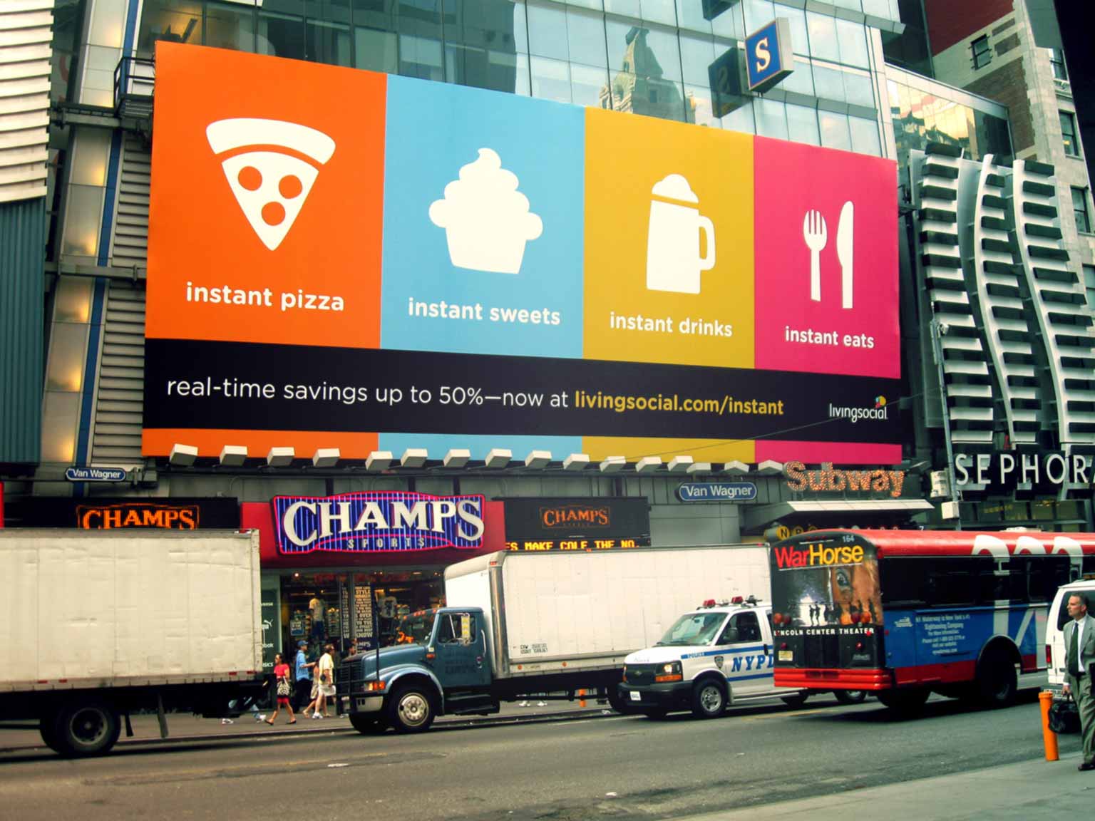 LivingSocial icons used on a billboard in Times Square
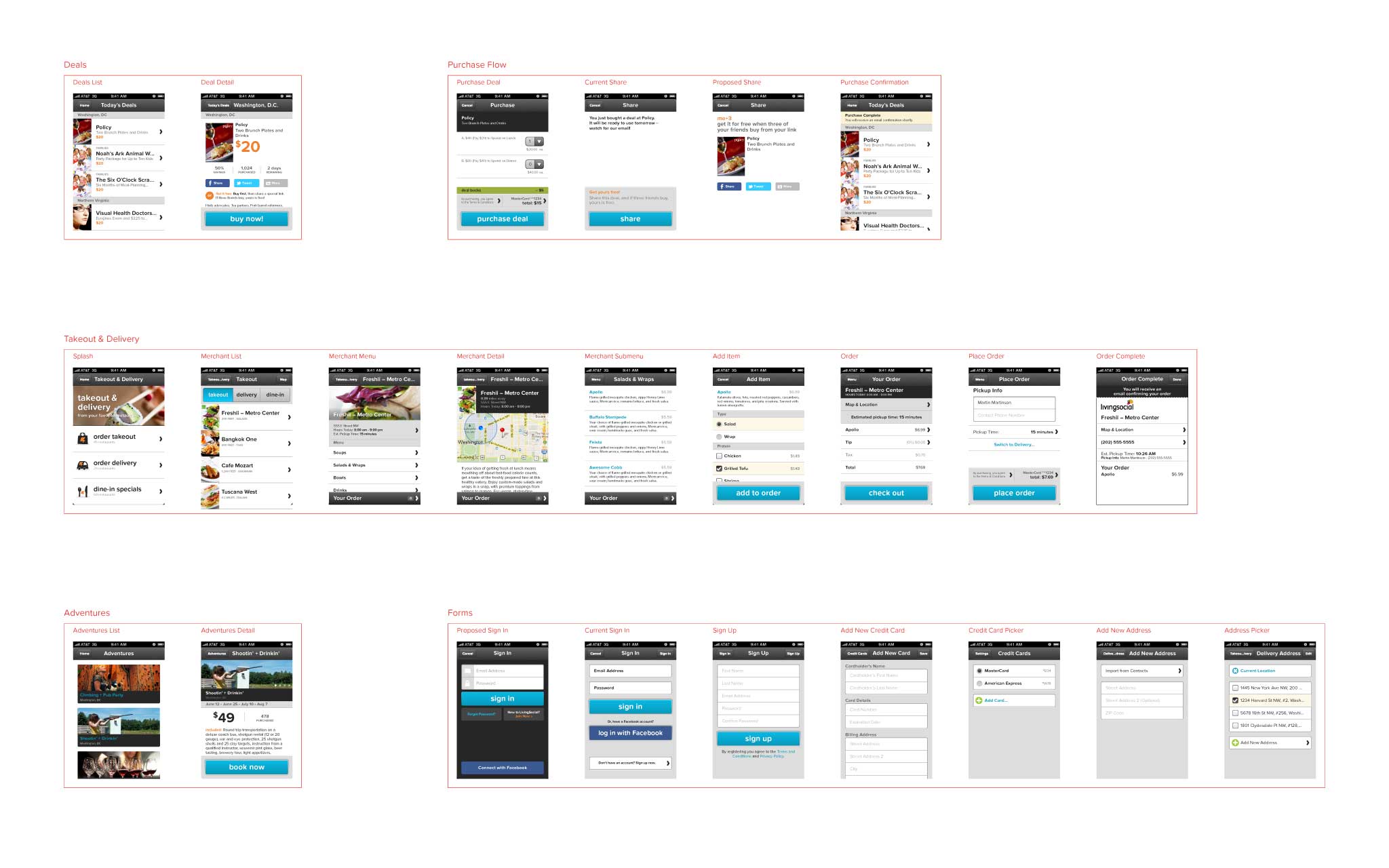
The iPhone App
The platform was growing quickly and there was a desire to test out several new products in different markets. The iPhone app at the time was not well suited to scale to meet business goals, so a product manager, the iOS developer, and I began brainstorming and sketching ideas for the next version. I was also tasked with bringing the visual design in-line with the new branding.
I mocked up several directions for the app, using the new, still evolving visual identity, and regularly checked in with rest of the design team for group critiques, iterating on the different options as we went along.
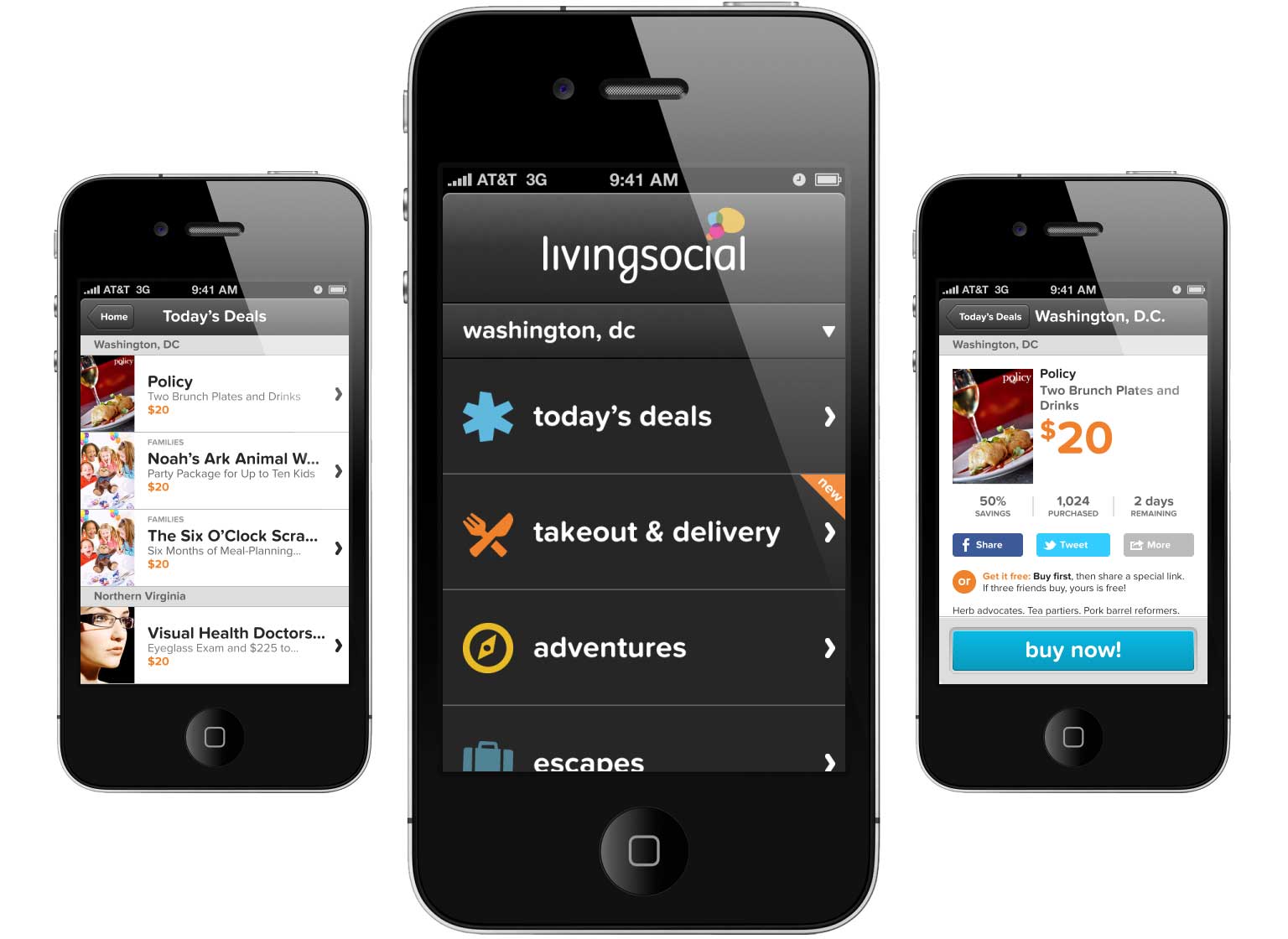 LivingSocial iPhone App
With the desire to release the new app in time for our Super Bowl Ad, we iterated on a couple directions for an MVP and did guerilla usability testing in the Chinatown neighborhood of DC.
Experimental Products
Over the next few weeks, we continued to iterate on the app, with a new release going out about once every two weeks. One of the big new products the company wanted to launch was a mobile-only instantly-redeemable deals platform. This product would only launch in specific cities, and we explored several different options for how to handle the location-based app navigation.
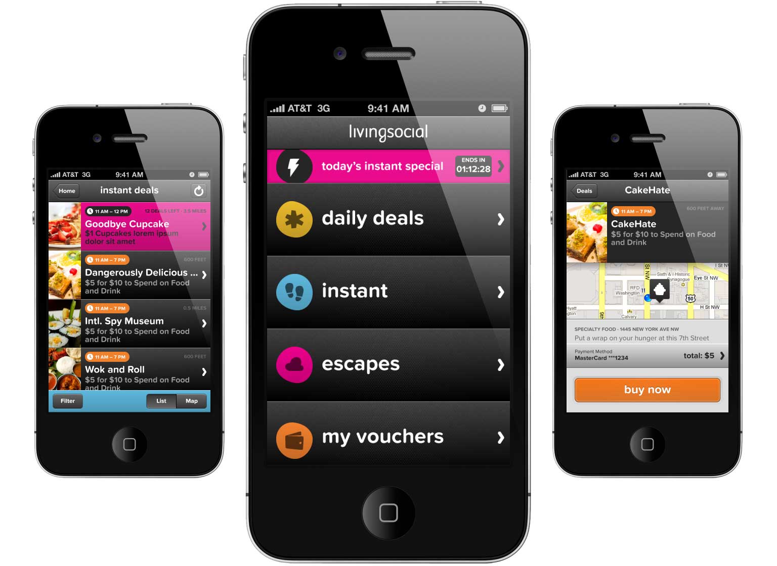 LivingSocial Instant Deals
Launching with a huge PR stunt in DC – the company offered a $1 lunch for anyone using the new Instant Deals product – the backend infrastructure got hit hard, and the development team worked all day to keep things running. Meanwhile, the executive team realized that they needed a desktop counterpart for their mobile-only product.
JSIO
Taking direction from the design of the mobile app, I worked closely with a front-end developer to design and build a desktop version. The CTO had a saying, JSIO: just shit it out – and that’s what we did. That was a long day.
 Redemption App Prototype & Merchant Center Wireframes
Merchant Tools
Around the same time, the company had been working with a local rails development agency to build merchant tools for these new products. LivingSocial acquired this agency, and I began working with them on information architecture and an MVP for the merchant tools.
Pivoting
After several attempts at marketing Instant Deals, the business model just wasn’t working. The company decided to pivot this product into a direct competitor with Seamless. I worked on IA for an app that would host several hundred different restaurants with drastically different food menus. I spoke with several internal sales people and a few local restaurants to research what their needs were.
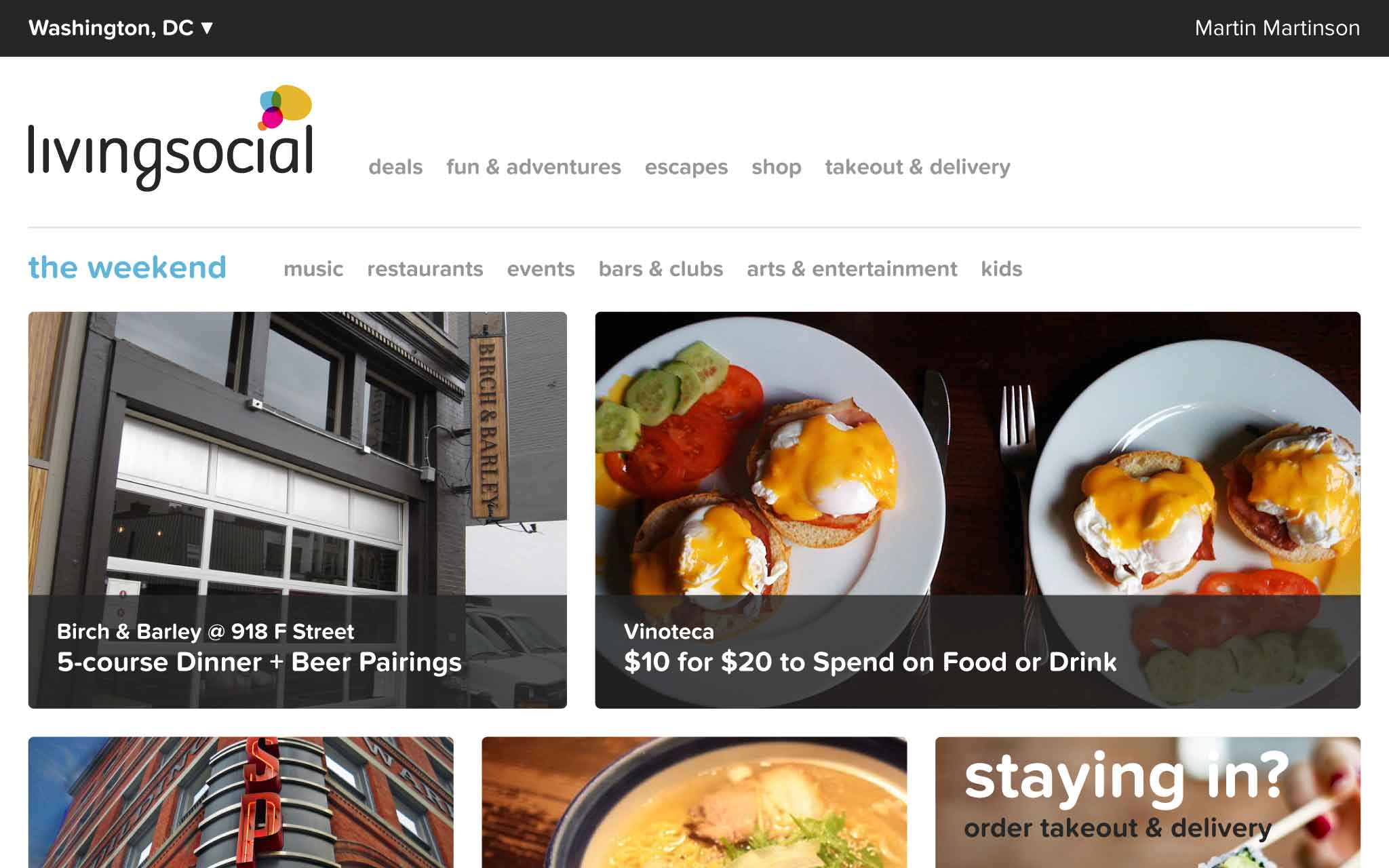
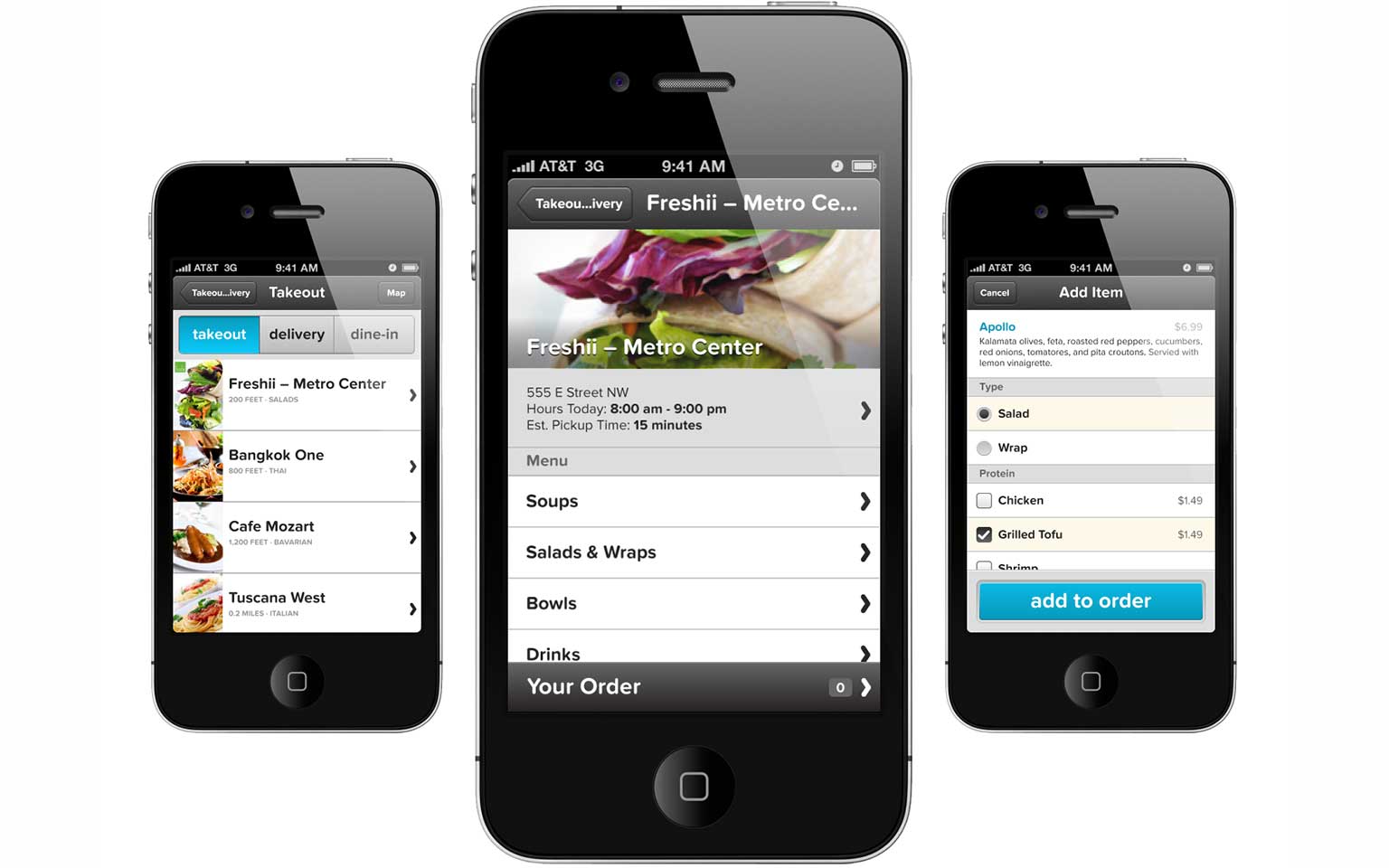 LivingSocial Takeout & Delivery
Scaling Information Architecture
The design team and the product grew quite a bit over the next few months. User research had shown that customers’ brand perception and understanding of our product offerings was failing our business goals. The newly hired UX Director got the entire design team together to work on the consumer-facing product’s IA. We split into five teams of three to four people each to brainstorm and sketch out ideas, meeting regularly with the entire team to critique and discuss.
 Responsive prototype
 IA diagram
One of my coworkers on the team had conducted an online open card sort and had been working with the user research and Marketing teams to help inform our direction. Using groupings and labels based on this research, we created a content model, proposed a navigation system for both mobile and desktop, and created a clickable prototype using Bootstrap to demonstrate a responsive website using this new system.
After we stole a few ideas from the others, the design team decided that the direction my group had was the strongest. We presented it to the executives and the rest of the product development team and got immediate buy in. Reorganizing
Soon after, a few of us on the UX team went to IA Summit in New Orleans. I had a blast and was very inspired by the speakers I saw. But the timing of my flight caused me to miss an outside product management consultant’s work and presentation on our company’s process and organization. When I flew back to DC, the entire product development team was now organized by pods that aligned with the new product IA.
 iPhone app master template
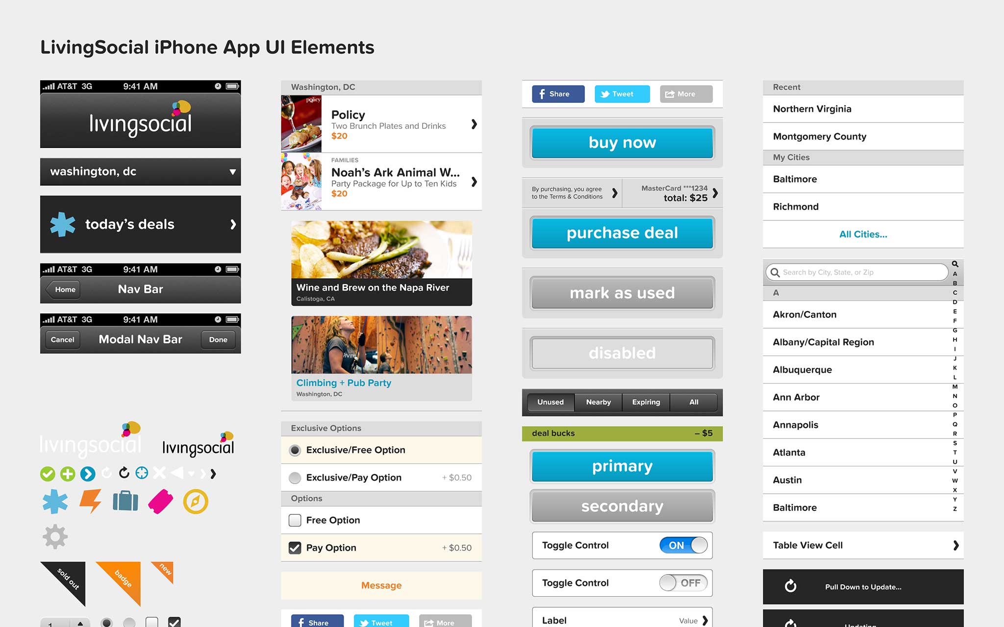 iPhone app UI components
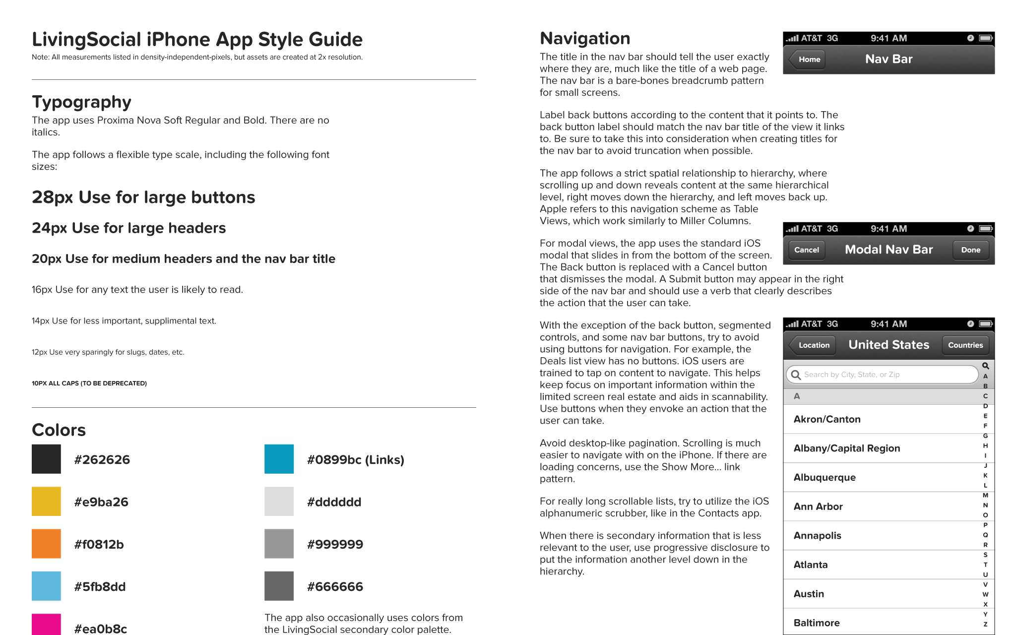 iPhone app style guide
Championing a Mobile-First Approach
Part of the new IA and company organization required every designer to work on the mobile component of their product, rather than delegating it to a separate team. With the support of the UX Director, I was a huge proponent of mobile-first responsive design, and I spent most of my time working closely with the other designers on using this approach. I became the go-to guy for anything mobile related, and I learned a lot about teaching others.
My Fifth Metacarpal
Shortly after, I was doored by a cab while riding my bike and broke the fifth metacarpal in my dominant hand. After talking to HR and my manager, I decided to continue working in a different capacity – in more of a UX director role – and participated in or facilitated every design studio session the UX team held. I learned a lot then, including how it’s easier to type one handed than use Adobe apps, that my left-handed sketches looked more like cave paintings than interfaces, that cross-team strong communication can lead to a lot of great things, and that some of the most important parts of design process don’t require a computer at all.